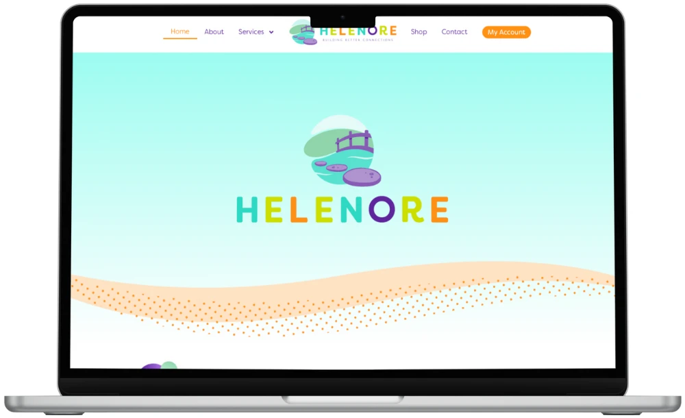
Helenore required a refined, design-led website that reflected the brand’s values, aesthetic and attention to detail, while providing a clear and intuitive user experience. The project focused on elevating the online presence, improving structure and ensuring the website could support future growth.
WHAT WE DID FOR HELENORE:
We worked closely with Helenore from the outset to understand the brand, audience and long-term ambitions. Using a staged approach, we began with planning and mockups to map the user journey and visual direction before moving into build. The website was developed with careful attention to layout, typography and imagery, ensuring the design felt considered and aligned with the brand. Throughout the project, communication remained open and transparent, with regular check-ins to review progress and make refinements together.
IN CONCLUSION
The finished website provides Helenore with a polished, confident digital presence that reflects the quality of the brand. Strategic website design has created a strong foundation that supports credibility, clarity and future development.
A design-led brand has little room for error. Visitors form a view quickly, and small details like spacing, type and image choice shape it. Helenore needed a website that held to the same standard as the brand itself.
The site also had to be easy to use. A beautiful page that confuses people does not help anyone. The task was to balance a refined look with a clear structure, and to leave room for the brand to develop.
Reflect the brand's values and aesthetic
Keep the experience clear and intuitive
Build a structure that can grow over time
Our approach
We started by listening. Before any design work, we wanted to know who Helenore speaks to and where it wants to go. That shaped every decision after.
We then worked in stages. Planning and mockups came first, so we could map how people move through the site and agree the visual direction. Changing a mockup is quicker and cheaper than changing a finished build, so this step protects both budget and quality.
Planning: audience, goals and user journey
Mockups: layout, typography and imagery agreed before build
Build: careful attention to detail on every page
Check-ins: regular reviews so refinements happen together
What changed
The biggest change is how the website feels. Layout, typography and imagery now work together, and the site looks like the brand it represents.
Visitors get a clearer route through the content. Helenore also has a structure it can build on. When the time comes to add new pages or ideas, the foundations are already in place, so there is no need to start again.
What other organisations can learn
Whatever your sector, a few lessons from this project apply. They matter just as much for a care provider or charity as for a design-led brand.
Plan the journey before the visuals. Know what people need to do, then design around it.
Review mockups properly. Give honest feedback early, while changes are simple.
Design for growth. Ask what you might add in a year and make sure the structure allows it.
Keep communication regular. Short, frequent check-ins beat one big review at the end.
Remember the basics. Accessibility, clear navigation and GDPR-compliant cookie and data handling should be part of the design, not an afterthought.
Frequently asked questions
Why do you create mockups before building a website?
Mockups let you see the layout, typography and imagery before any development starts. It is far easier to adjust a design than a finished site. It also means everyone agrees the direction early.
How involved will I need to be in a web design project?
Your input matters most at the start and at each review stage. We share progress through regular check-ins and ask for clear feedback. You do not need to be technical, just clear about what feels right for your brand.
Can a design-led website still be easy to use?
Yes, and it should be. Good design and good usability work together. We plan the user journey first, then shape the visuals around it, so the site looks refined and stays simple to navigate.
How do you make sure a website can support future growth?
We think about structure from the outset. That means planning navigation, page templates and content areas so new sections can be added without a rebuild. We will talk through your longer-term plans in a planning session.