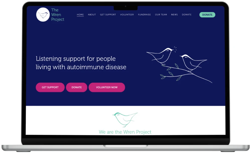
The Wren Project is a charity supporting people living with autoimmune disease through listening support, peer connection and accessible services. The organisation required a website that clearly communicated its purpose, made it easy for people to access support and reflected the sensitivity and care at the heart of its work. The site needed to support multiple audiences, including people seeking help, volunteers, funders and partners, while remaining calm, clear and reassuring.
WHAT WE DID FOR THE WREN PROJECT:
We worked with The Wren Project to design and build a website that prioritised accessibility, clarity and trust. A staged approach was used, starting with structure and user journeys to ensure visitors could easily find information about services such as one-to-one support, group sessions and young person services. Design decisions focused on creating a warm, supportive digital environment, with content structured to reduce overwhelm and guide users gently towards the right support. The website was also built to support fundraising and volunteering activity, with clear pathways and calls to action. Collaboration and transparency were central throughout, ensuring the website reflected lived experience, safeguarding considerations and the organisation’s values.
IN CONCLUSION
The new website provides The Wren Project with a clear, compassionate digital platform that supports access to services and organisational sustainability. Thoughtful website design has helped strengthen trust, improve usability and ensure people can find support when they need it most.
Autoimmune conditions can be unpredictable and exhausting. Someone arriving at a charity website may be unwell, anxious or caring for a person they love. They may have very little energy left to search for answers.
The Wren Project also had to speak to several audiences at once. A person looking for listening support needs something quite different from a funder reading about the charity's work. Fitting all of that into one site without it feeling crowded was the real test.
People seeking support, who need reassurance and a clear first step
Volunteers, who need to know how they can help
Funders and partners, who need to understand the charity's purpose and reach
Our approach
We began with structure, not visuals. Before any design work, we mapped the journeys each audience would take and agreed what each visitor should find first. This made sure one-to-one support, group sessions and young person services were easy to spot.
Design then followed that structure. We kept the look warm and calm, with generous space and content in short, manageable pieces. The aim was a site that never asks too much of someone who is already tired.
We also worked openly with the team throughout. That meant lived experience and safeguarding considerations shaped decisions as they were made, rather than being checked at the end.
Journeys planned before any page was designed
Plain, gentle wording that guides people to the right service
Clear next steps for donating and volunteering
Accessibility treated as a starting point, not an extra
What changed
We won't put numbers on this, because none were shared with us. What we can describe is the difference in how the site works.
People can now see what support exists and how to reach it without hunting through pages. Volunteers and supporters have obvious routes to get involved. The team has a website that sounds like the charity and reflects the care in its work.
For a project like this, success looks like someone finding the right service on their first visit and leaving feeling a little more reassured. It also looks like staff spending less time pointing people to information that is already there.
What other organisations can learn
Many of the lessons here apply to any charity or care provider with a sensitive subject and a mixed audience.
Start with the person in need, not your organisation chart.
Offer fewer choices and clearer next steps on every page.
Write about difficult topics plainly and kindly.
Involve people with lived experience early, not just at sign-off.
Think about safeguarding and GDPR wherever forms or contact details are collected.
Make fundraising and volunteering visible without letting them crowd out support.
Frequently asked questions
How do you make a charity website accessible?
We build accessibility in from the start. That means clear structure, readable text, strong colour contrast and simple navigation. We usually work towards WCAG 2.2 AA, the common standard, and test with real use in mind.
Can one website serve both service users and funders?
Yes, if the pathways are clear. We plan separate journeys for each audience so people reach what they need quickly. Someone seeking help should never have to wade through funding information first.
How do you handle sensitive subjects and safeguarding?
We work closely with your team so your values, lived experience and safeguarding policies guide the wording and layout. We also consider how forms and contact details are handled under GDPR.
How do we get started on a similar project?
Book a planning session. We will talk through your audiences, goals and priorities, then suggest a staged plan that suits your organisation.